I have no idea how to introduce this. The long and short is that I like the Mismagius EX card art in Pokemon TCG Pocket a bunch and I want to write about it. There’s not really a good format I can borrow for this – a single illustration isn’t usually the sort of thing people make long posts about – and reviews and analysis are usually tied up in consumerism. I guess I’ll just be winging it.
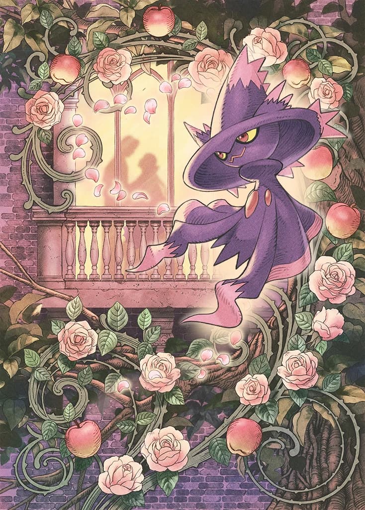
Kuroimori’s doing a whole lot of little things in this image, so to start and give myself some grounding, let’s just describe the card flatly. A Mismagius appears to be floating away from a balcony where the silhouettes of two people are having an intimate moment. Rose petals frame the pair in a heart shape, leading directly to the Mismagius. Framing the balcony and the card are vines laden with roses and apples and thorns.
Already this is a bit of a curious framing. I haven’t kept up with the Pokémon lore too closely but I would have thought Mismagius would be one of those ill omen harbinger type Pokémon, especially coming after Misdreavus playing tricks on people, so I guess it’s time to consult the Pokédex to see what’s going on there. Now, my gut recollection from playing Diamond seems to have been right, over there it said, “Its cries sound like incantations. Those hearing it are tormented by headaches and hallucinations.” However, there is another strain of entries for Mismagius. This broadly continues for a few generations up until Pokémon Moon, where its entry changes a bit to say “Mismagius have been known to cast spells to make people fall in love, so some people search for this Pokémon as if their life depended on it.” That’s a way stronger basis to work with for an illustration, and also this card came out in February so that all checks out for how they got to this idea.
But what else can we infer from this image? It’s pretty densely packed for what it is. I guess the part that gets me next are the apples being mixed in with the roses on the border. It’s all these rose vines coiled around the branches of an apple tree. Now, I’m a moron when it comes to symbolism so I’m just going to roll with the most common interpretations and uses of these and see what comes out. Pink roses are pretty much the universal signifier of love. Great, obvious. The bit that gets me though is that apples are generally used as a forbidden or poisoned fruit. Garden of Eden, Snow White, that sort of thing. So like my gut read is that it’s something about a kind of forbidden love, where the passion of the moment might be intrinsically poisoned in some way. However, when I look it up to double-check it seems like there’s a pretty common interpretation in secular symbols where the apple is just used as a symbol for love, so I guess Kuroimori’s probably just rolling with that strain of it and wasn’t thinking that intensely about it. There are a lot of parts of the image where if I squint I can almost say that there’s a poison pill hidden in the symbols or the color choice or something, but those require so many more mental gymnastics than just taking it on its face and seeing it as a sweet scene where the Mismagius helped bring a young couple together.
Great, we understand the meaning of the image. Now I want to talk a bit about the technical bits of it. The major line of action is drawn by the roses and it runs through Mismagius’s pose and spirals towards the couple. The color palette is mostly pretty moody and dark browns and greens and desaturated so that the yellows and reds can contrast and create a stronger feeling of warmth which lets Mismagius pop as the focus of the scene, but also to function as a way of making the scene feel older. This scene is downright gothic, in basically every definition of the term. Archways, thorns, ghosts, roses, witches, romance, it’s all hella goth. It looks like most of the coloring is some kind of watercolor with a bit of airbrushing in a couple places, and then the rounded edges are accented with contour lines to better imply the shading and add texture in that kind of way that you see in more formal and older works like medieval manuscripts and bank notes and I think the Winnie the Pooh books did it too?
I can’t overstate how much I really like how Kuroimori does that light accent of hatching and I want to write about it more because I want to understand how it works and what it’s doing. It’s done right at the boundary between light and dark and it helps to define the volume and shadow a bit more subtly without expanding the color palette any more than is necessary. I wonder if it’s done first to help figure out where to put the light and shadows or second to emphasize them.
I don’t know how to really segue into this but I want to talk about some bits that caught my eye while I’ve been staring at this picture. You can see some remnants of the digital process in a couple places where the default Photoshop eraser rears its head with the half-erased pillar to the left of Mismagius’s hat, the speck above the center of the rose petal hearts, and the round yellow bits next to the post below the left silhouette. My guess from my own experience is that the first two of those are remnants of an earlier draft that just got forgotten about, and the third is just an accident, unless they were trying to imply a dracula cape there.
I can’t think of much else to say beyond that. I’m rapidly approaching somewhere around a thousand words and I don’t know that I have the technical or analytic skill to do much more than that for a single image right now